Architect Dad’s Sydney Loft Transformation
As an architect and journalist for an architectural website, I’m thrilled to share an incredible transformation that proves you don’t need sprawling square footage to live grandly. This project, spearheaded by architect Ed Litman for his son Mitch, a chef, takes a compact Sydney apartment and turns it into a masterclass in efficient, beautiful living.
Architect Dad Transforms 538 Sq. Ft. Sydney Apartment into a Chef’s Dream & Design Showcase
Ever wondered how to make a small space feel expansive, functional, and even luxurious? Look no further than this inspiring 50-square-meter (538 sq. ft.) apartment in Darlinghurst, an inner-city part of Sydney known for its dense population, restaurants, shops, and proximity to the Central Business District.
This wasn’t just any renovation; it was a passion project between architect Ed Litman, founder of Litman Partnership, and his son Mitch, a chef. Mitch had a specific, challenging brief: he needed a top-notch kitchen, a mezzanine bed, and for the final result to be “good enough to appear on Never Too Small”. Spoiler alert: they nailed it.
From Pokey Warehouse to Palatial Pad: The “More with Less” Philosophy
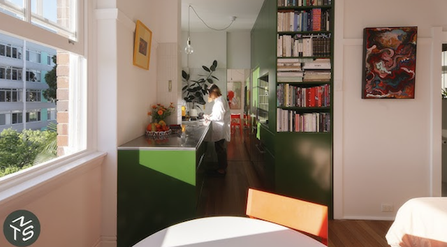
Originally a Reader’s Digest warehouse, the building was converted into residential apartments 50 years ago, boasting an impressive 3.6-meter (approx. 11.8 ft.) ceiling height. The apartment, however, was initially “pokey and dark,” with ugly light fittings, a cramped bedroom, and a galley kitchen that felt even smaller due to an island.
Ed Litman’s overarching design goal was to “do more with less”. This isn’t just about fitting things in; it’s about finding the “most simple practical and high performance solution” for a space where there’s “no room for extravagance,” but a definite need to be “livable and delightful”. The transformation saw the space stripped back to basics, revealing original beams and walls, allowing the original structure to shine through.
The Elevated Loft: A Masterstroke in Space Creation
The single most impactful design decision was elevating the loft bed. This ingenious move unlocked a significant amount of usable floor area underneath, proving that vertical space is just as valuable as horizontal. Crucially, there’s sufficient headroom to walk under the mattress, transforming what would typically be dead space into highly functional zones.
Under-Loft Utility: Around the perimeter of this elevated undercroft, you’ll find a clothing wardrobe and a desk with a window, creating a private study nook that feels “cozy” and reminiscent of a “caravan or a boat”.
Seamless Integration: The bed itself is made entirely out of plywood – including the floor, bed base, and cupboards below – all fabricated off-site in a joiner’s workshop and then assembled on location. The mattress is slightly raised above the platform, not just for easier access, but specifically to create that essential headroom below.
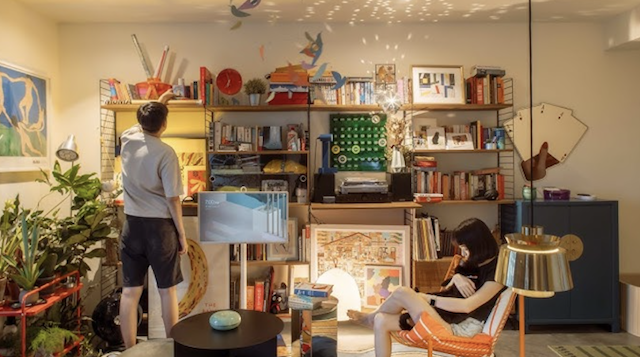
Visual Connection & Privacy: The bedroom loft overlooks the living room, allowing for engagement with activities below, creating a “grand and luxurious” feeling. Yet, a clever barrier of big timber shelves acts as both a desk (where one can “dangle your feet and write your memoirs or read a book”) and a screen, providing a sense of separation and privacy from the living area. The existing window was also cleverly integrated, with the platform not quite meeting it, allowing light to filter through to the desk below.
A Chef’s Kitchen & Smart Storage Solutions
Given Mitch’s profession, the kitchen was a priority. It features a stainless steel bench, a material Mitch is accustomed to, and a mirrored splashback. This mirror serves a double purpose: it makes the room feel bigger and allows the chef to see guests even with their back turned. The design prioritizes practicality with deep, wide drawers, which are much easier to access than narrow ones. Adding to the resourcefulness, the fridge was existing, and the gas cooktop was a lucky find, being “thrown out by a friend”.
Storage is paramount in a small apartment, and no space is wasted. A prominent storage wall near the front door creates a “sense of arrival”. This joinery, like much of the apartment’s built-ins, extends all the way up to the ceiling, maximizing vertical storage for items not needed daily. The new timber floor, similar to the joinery, ensures a cohesive look, creating an elegant visual flow. Even under the stairs, storage cubicles were designed for shoes, jumpers, and knitwear.
Sustainable Design & Aesthetic Simplicity
The apartment’s palette is kept “very simple,” with the choice of white making the space feel bigger and the extensive use of timber providing warmth and a pleasant scent. Timber was chosen for its sustainability. The joinery is custom-designed to accommodate the imperfections of an old building, where floors and ceilings are not level.
The living area is adaptable, and all the furniture, acquired by Mitch “off marketplace,” is secondhand and eclectic, adding character. Even the lighting strategy is thoughtful: an aluminium uplight throws light upwards, enhancing the sense of space and guiding the eye through the apartment.
This apartment is designed primarily for one person, or perhaps a partner, making extensive privacy concerns unnecessary and allowing for the feeling of “one big volume,” which contributes to its luxurious feel. It embodies the essence of “simplicity,” striving for practical, high-performance solutions.
This project isn’t just a renovation; it’s an excellent example of sustainable architecture, converting an old building for new use rather than demolishing it. It perfectly aligns with the principles explored in movements like Japanese compact homes, where architects like Teeshi Hosaka bend space and light, and designers like Naoto Fukasawa find the “essence of an object”. It’s a testament that thoughtful design can truly make a small space feel grand, practical, and a delight to live in.